Sunday, 29 November 2015

artist research


                             Hyuro


This street art is the most like what I have been doing in my sketchbook, as it contains no colour, and is generally on textured plain white backgrounds. I like his work, as I think it gives the audience an opportunity to apply their own meaning to the graffiti. To me, this image represents a single mother and her struggles. I couldn't possibly tell you why, although I do think that it might have something to do with the smoky background. The grey and black in the image contrast to some of the ideas I have had, although I think they're growing on me more.


                         Os Gemeos
 
 
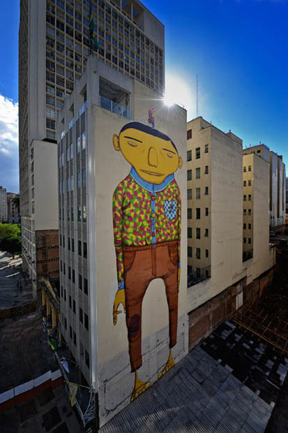
I liked these images, as to me it represents something fun and exciting and new, because most 'famous' street art seems to be very literal and realistic, however this is most definitely not. the animated people depicted in every image almost seem childlike in their makeup, however the overall quality adds a touch of professionalism.

the colours in these pieces have been selected well, and jugging from the complimentary and sometimes very neon colours, they seem to remind me of the 80's which would fit into the theme of time and memories.`
                               Vhils
 
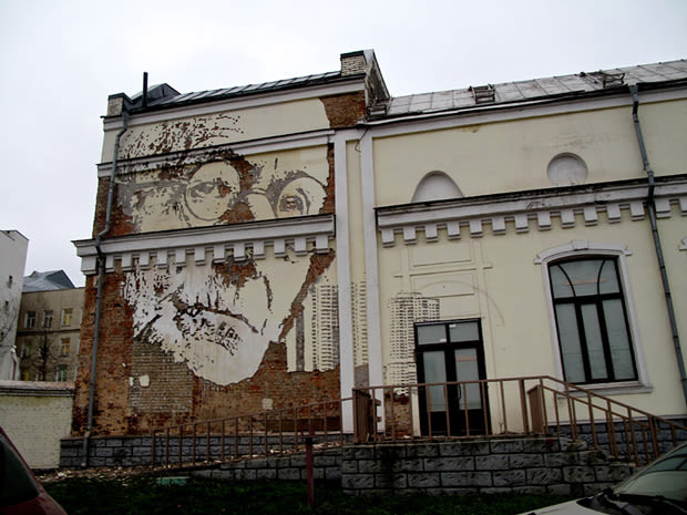
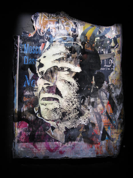
This street art also inspired me even though it contrasts with the other styles that I have selected as these are very photo-realistic. the artist depicts faces onto sides of buildings, in a way that almost looks like printing.

I like that the artist is capturing peoples faces, many people that we, the audience, don't know. this allows us to put our own personal story to each piece of art. we get to analyse every wrinkle, cut and scar, and come up with our own reason that that person got it.


.


robert rauschenberg


Robert Rauschenberg
rauschenberg-signs-for-blog
 

Robert Rauschenberg released ‘Signs’ in June of 1970. In the image we can see a lot of controversial pictures, some based around politics and others popular culture of the time. We see both the Kennedy brothers, who were both shot in the 60’s. We see Janis Joplin who was known for her controversial take on music (who sadly died a few months after the image was released). The image also contains Martin Luther King, who is obviously well known for tackling racism in the 60’s. The image also contains Vietnamese soldiers who are fighting in the war. The image also includes, astronaut Buzz Aldrin.

The image mainly contains the colours white, black, brown, green, and red. Green and red are complimentary colours, and make each other seem more vibrant, which means in this case, the army green of soldier uniforms, and the red of Joplin stand out the most.

To me this piece of artwork shows the contrast between the tragedies and the victories of the 60’s, and in this picture the bad seems to outweigh the good, and to me that is presented in the lack of bright colour and light.

Sunday, 1 November 2015

My theme: Family Tree

this is my mom's lighter, she got the lighter when she was 18 from a trip to Florida, she told me that she can never lose it, as it always finds it's way back to her. I remember her always having it when I was growing up. I though this would be interesting to study as the exterior and interior of the lighter are so different. the outside is shiny and untarnished, but the inside is dull, and used.


this is my Great Grandma's fan, and I remember her giving this to me when I was about eight. she told me that her husband bought it for her in 1950. I used to collect fans when I was younger, and this is by far my favourite, as although it's a little broken it means the most to me. I thought picture of the fan would be good for collage as I can create similar layers to the fan.


These medicine bottles have been on my mom's dressing table for as long as I can remember. she told me that her mom gave them to her, as they were sitting in her garage. she remembers that her grandfather used to have his medication in them. I though these would be good for collage and water colour, due to the different tones of blue.


this is one of my grandmother's rings, although I have never met her, I have been told that she loved her jewellery. my mom was given this ring before she died. I thought the ring would be a good study due to the contrast in textures between the band and the actual stone.

 
I have chosen to do 'Family Tree' as my theme, because it interests me, and there are a lot of different and interesting stories that occur within my families history, ranging from war, to crime. So I want to study portraits and objects from the families past.

Monday, 19 October 2015

collage task

 "Globules" by Stephanie Ledoux:

Isabelle Cochereau:
Isabelle Cochereau uses a lot of different materials and media to create her collages and then sometimes she layers different medias on top. I liked her work because its very abstract and has a lot of layering.
this is my version of the collage
"Globules" by Stephanie Ledoux:
this is 'Globules' by Stephanie Ledoux, I liked her work because of the simplicity of it, it looks very basic, but still has a lot of detail, and tone.e
this is my first try at replicating her work

this is the second try, and I think it is more her style.
by christine peloquin:
This is by Christine Peloquin, and she does large scale collages using mixed media, what stood out to me about this picture was the contrast between colours and I tried to replicate that in my own collage

Jacque Villegle:
this work is done by Jacques Villegle, and he takes ripped pieces of billboard advertisement, and layers them on top of one another. his work stood out to me as although it's abstract, each piece still has a meaning.

this is my version of his work, and I found this one the most challenging as it was hard to be 'messy' with my work.


Thursday, 8 October 2015

Sunday, 20 September 2015

top ten photos

this photo links to memories, as the picture in the centre is of my grandparents on their wedding day.

this picture also links to memories, as my mom and I always collect unique glass bottles from places we have been.


this is a close up of a 'Pixies' vinyl, on the record player I bought my mum for Christmas a few years ago, so it's kind of mixing time and memories.


this is a close up of the needle on the record player, this links to memories, because like when you tell a story you are only scratching the surface.

this is a picture of some of the records I own, many are of the same genre, but come from different time periods

this is a close up of my fender guitar, as you can see the strings are very worn, and it's a bit dusty, but that's because I haven't played it since my last gig.


this is another picture of a guitar, but this was my mums, I remember her telling me that she bought it in 1995 for £30 of a friend, because he wanted beer money.

this is a picture of some graffiti that I saw, I think it reflects on memory, as many people have 'tagged' themselves there, and also it relates to time and memories, because it says 'punks not dead'

I saw this building when I went on a walk, and I thought it mixed old with new. the building is obviously very old, but there is new graffiti all over it.

this photo shows time, and the fact that it runs out. this is a picture of a flower arrangement at my granddads funeral. Each white represented a grandchild.

I took this photo in Bath, and it brings back memories with friends.