ASArtNeveCurtis
Thursday, 11 February 2016
Acrylic
Acrylic paint is a fast-drying paint containing pigment suspension in acrylic polymer emulsion. Acrylic paints are water-soluble, but become water-resistant when dry.
I found working with acrylic difficult, because of how fast it dried, I tried to combat this by adding water to the paint. but this only dulled down the colours.
when replicating a picture I found that mixing for a single block colour was easy. However, when I needed to paint grass, I found it difficult to create dimension, and get the correct shades, to make it photo realistic.
On the other hand, I really enjoyed my first experience with acrylic, and I feel it would be better for when I want to create a more abstract piece. I would like to continue these experiments in the future, as I feel they could look very good layered over pictures, and by using vibrant colours would link to my themes, of street art and the 80's
Sunday, 31 January 2016
Nel Ten Wolde
this piece is called 'Torre' by Nel Ten Wolde, and was completed on 2015. she has used warm, harmonious colours to create this image, making it look complete and natural even though the images themselves are actually broken up. The drawing on the image replicate the photos, which show a bigger relation between the real photos, and the drawings.
After reading about Nel Ten Wolde's work she said it reflects on journeys. the original pictures were meant to be drawing material. However, she wants to use fragments of pictures and drawing to bring a whole image together.
Thursday, 14 January 2016
Transfer Techniques
Transfer Techniques
there are lots of different transfer techniques.
however, I found teaching them to other students, helped me to develop my ideas, and produce a higher standard of transfer techniques. not only was I able to learn from my own transfers, but I was able to learn from people that I was teaching, as I got to see there mistakes and successes.
Everyone did a cellotape transfer, and were all mostly successful, in creating a clear tonal image on cellotape.
Sunday, 10 January 2016
Sunday, 29 November 2015
artist research
Hyuro
This street art is the most
like what I have been doing in my sketchbook, as it contains no colour, and is
generally on textured plain white backgrounds. I like his work, as I think it gives the audience an opportunity to apply their own meaning to the graffiti. To me, this image represents a single mother and her struggles. I couldn't possibly tell you why, although I do think that it might have something to do with the smoky background. The grey and black in the image contrast to some of the ideas I have had, although I think they're growing on me more.
Os Gemeos


I liked these images, as to me it represents something fun and exciting and new, because most 'famous' street art seems to be very literal and realistic, however this is most definitely not. the animated people depicted in every image almost seem childlike in their makeup, however the overall quality adds a touch of professionalism.
the colours in these pieces have been selected well, and jugging from the complimentary and sometimes very neon colours, they seem to remind me of the 80's which would fit into the theme of time and memories.`
Vhils

This street art also inspired me even though it contrasts with the other styles that I have selected as these are very photo-realistic. the artist depicts faces onto sides of buildings, in a way that almost looks like printing.
I like that the artist is capturing peoples faces, many people that we, the audience, don't know. this allows us to put our own personal story to each piece of art. we get to analyse every wrinkle, cut and scar, and come up with our own reason that that person got it.
.
robert rauschenberg
Robert Rauschenberg

Robert
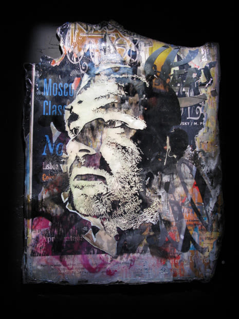
Rauschenberg released ‘Signs’ in June of 1970. In the image we can see a lot of
controversial pictures, some based around politics and others popular culture
of the time. We see both the Kennedy brothers, who were both shot in the 60’s.
We see Janis Joplin who was known for her controversial take on music (who
sadly died a few months after the image was released). The image also contains
Martin Luther King, who is obviously well known for tackling racism in the 60’s.
The image also contains Vietnamese soldiers who are fighting in the war. The
image also includes, astronaut Buzz Aldrin.
The
image mainly contains the colours white, black, brown, green, and red. Green and
red are complimentary colours, and make each other seem more vibrant, which
means in this case, the army green of soldier uniforms, and the red of Joplin stand
out the most.
To
me this piece of artwork shows the contrast between the tragedies and the
victories of the 60’s, and in this picture the bad seems to outweigh the good,
and to me that is presented in the lack of bright colour and light.
Subscribe to:
Posts (Atom)